


Overview
Developing a universal UI for all game types is nearly impossible. This section provides essential information to understand the GIS UI framework, offering entry points for UI customization.
- Options: Modify the default UI directly or reference it to build a custom UI.
- Prerequisite: Familiarity with the free Generic Game System (GGS) UI module, as GIS’s default UI is built upon it.
Design Considerations
To enhance versatility and adaptability, GIS’s UI framework adheres to the following principles:
- UI Zero Awareness: GIS core code/plugin has no awareness of UI, containing no UI code, allowing complete freedom in building the presentation layer.
- Default UI Provided Separately: All UI is implemented in the companion project, usable as-is or as a reference for custom UI.
- One-Way Communication: UI updates via core system events and retrieves display data via core system APIs; the core system never manipulates the UI.
- Leverage GGS UI Module: GIS’s default UI is developed using GGS’s CommonUI extensions, avoiding redundant development.
Default UI
All GIS functionalities are represented by corresponding default UI elements.
Block Field
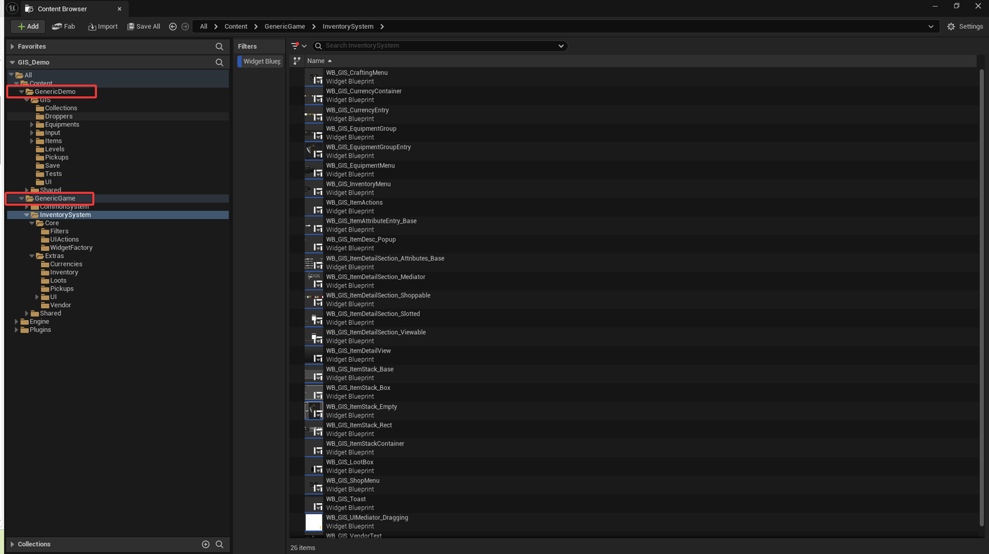
Inventory UI
ItemStackContainer
GIS manages items via item collections, providing WB_GIS_ItemStackContainer:
- Function: A logic-only Widget without visual presentation, reusable across different UI styles.
- Binding: Binds to any ListView (or derivatives like TileView) to display items.
- Dynamic Updates: Binds to a collection via CollectionTag, reflecting item additions/removals/modifications in the bound ListView.
- Entry Flexibility: Supports dynamic ListView Entry styles (e.g., rectangle, box).
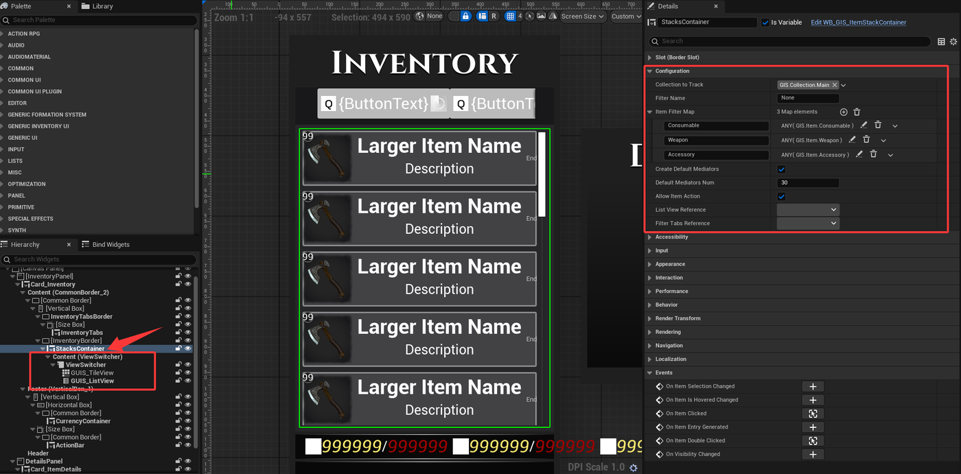
- Examples: InventoryMenu and EquipmentMenu in the companion project use the same ItemStackContainer, tracking different collections.
- Extension: For a skill collection, use ItemStackContainer to track Collection.Skills for a SkillsMenu.
ItemStack
GIS provides WB_GIS_ItemStack as the UI representation of item stacks, also serving as the ListView's EntryWidget.
- Default Styles: Includes rectangular (
WB_GIS_ItemStack_Rect) and square (WB_GIS_ItemStack_Box) EntryWidget options.
Dynamic Details Panel
Overview
Different items may have unique fragments extending fields, requiring varied UI displays.
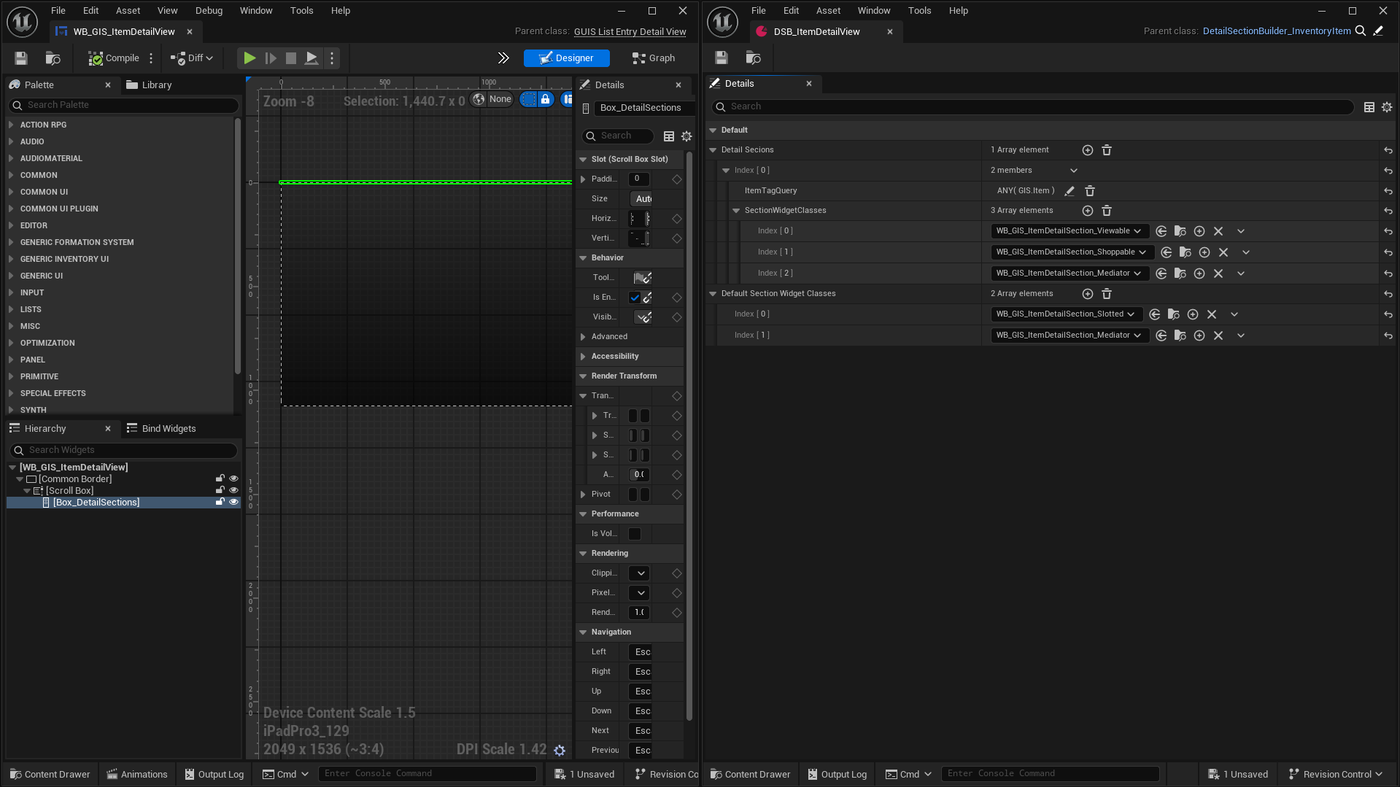
- Effect: Selecting an item in a ListView dynamically generates corresponding details content.
Usage
- Details Panel: Uses a DynamicEntryBox to dynamically add content.
- Data Asset: DetailSectionBuilder data asset specifies UI detail sections for items with different tags.
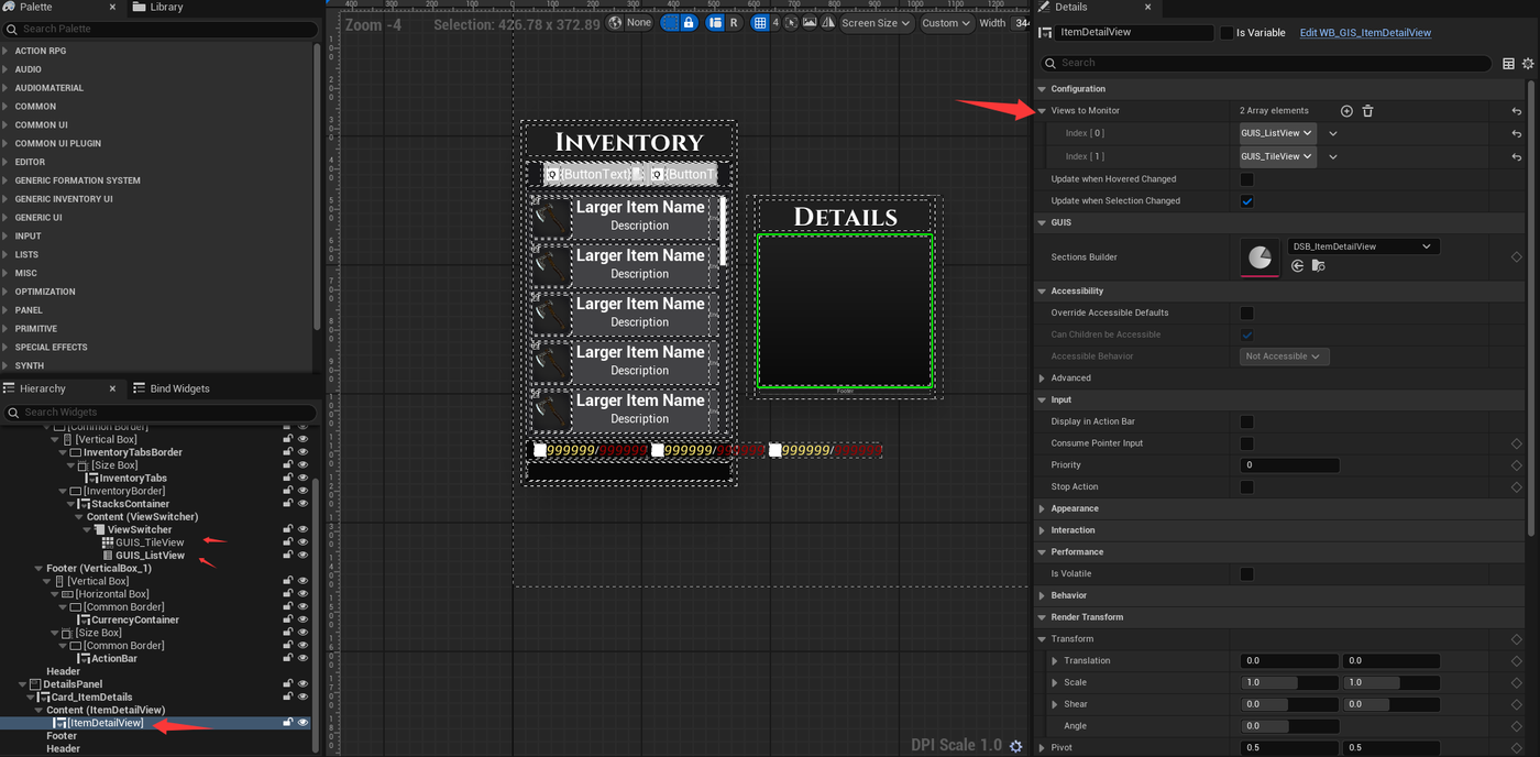
- Mechanism: The details panel monitors a set of ListView instances, rebuilding content for selected items based on DetailSectionBuilder’s specified SectionWidget and order.
Adding New Detail Section
- Steps:
- Create a new Widget inheriting from GUIS_ListEntryDetailSection.
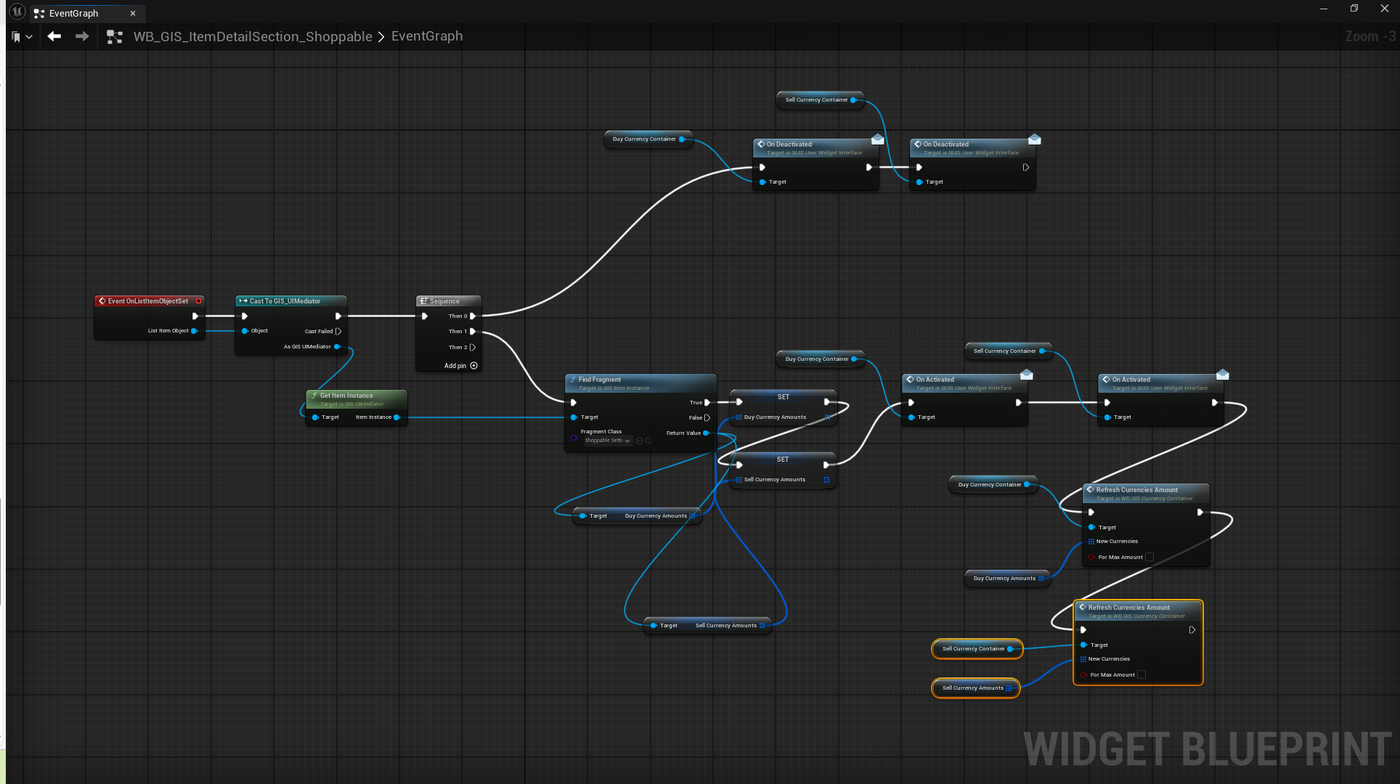
- In the Blueprint event graph, use the OnListItemObjectSet interface to retrieve the displayed object and update Widget data.
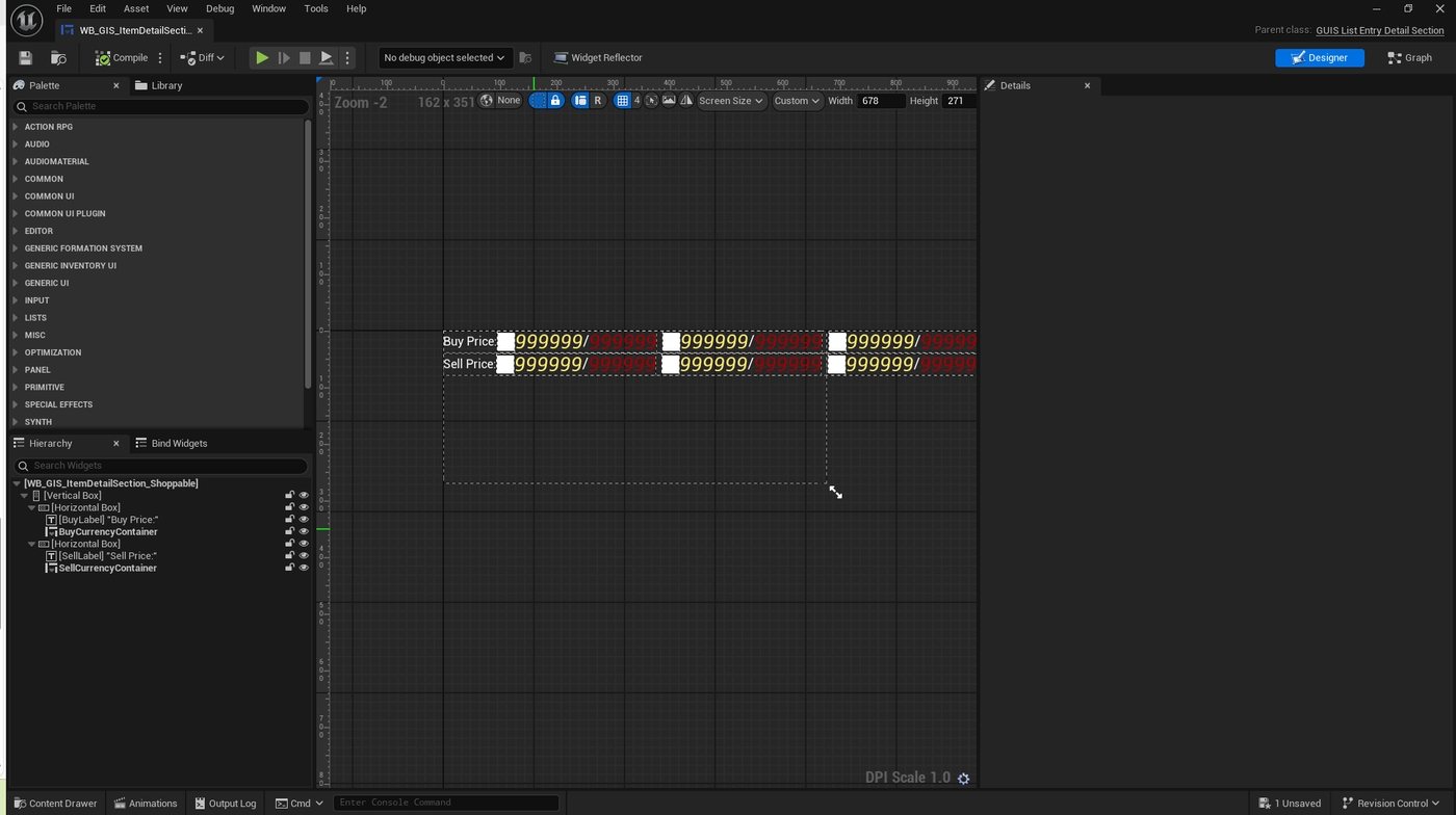
Example: WB_GIS_ItemDetailSection_Shoppable displays Shoppable fragment content (item buy/sell prices).
UMG Part:
Blueprint Part: Retrieves Shoppable data from the item instance, displayed via CurrencyContainer.
Block Field
Additional Information
- Companion Project: Explore more UI in the companion project, as documentation cannot fully replicate all UI details.
- Other System Documentation: Related systems’ documentation will cover corresponding UI and usage.